
Waiter Tips Prediction with Machine-Learning
Started: 2025-12-01
About this project
📈 Waiter Tips Prediction – My Machine Learning Journey
Author: Leon Motaung
Technologies Used: Python, Pandas, NumPy, Plotly, Matplotlib
🔍 Objective
The objective of this project is to explore how customer behaviour affects waiter tips. I used a real dataset to analyze the relationship between variables such as total bill, tip amount, day of the week, gender, smoker status, group size, and time of meal.
🚀 Steps I Took
- Created a Python virtual environment using:
python -m venv wenv
- Installed required libraries:
pip install pandas numpy plotly matplotlib
- Loaded dataset with:
data = pd.read_csv("tips.csv") - Explored the data using:
data.head() and data.describe()
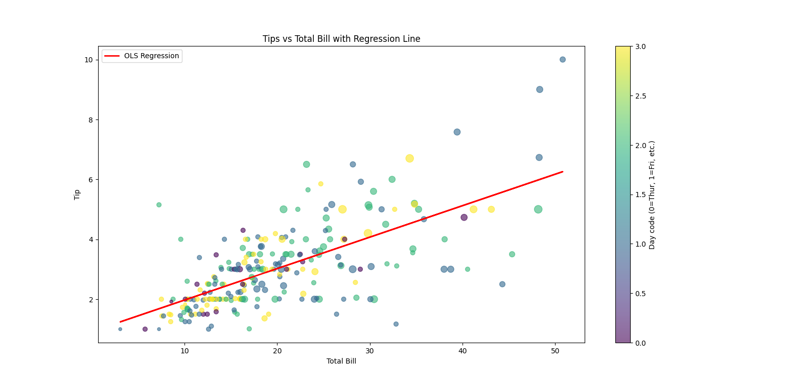
- Visualized total_bill vs tip using scatter plot with trendline.
📊 Visualization I Created
Scatter plot showing relationship between total bill and tip amount:
figure = px.scatter(
    data_frame = data,
    x="total_bill",
    y="tip",
    size="size",
    color="day",
    trendline="ols"
)
figure.show()
🧠 What I Learned
- Higher total bills often result in higher tips.
- Group size has an impact on tipping behaviour.
- Certain days show better tipping patterns than others.
- Trendline helps identify the overall tipping trend.
📂 Project Structure
data/– contains dataset (tips.csv)visuals/– saved data visualizationsscripts/– python files for analysisscatterplot.png– visualization: bill vs tip
🔥 This project helped me understand real-world data analysis and visualization using Python and machine learning concepts.
📌 Key Insights from the Analysis
💵 Bill Amount Strongly Correlates with Tip Size
The scatterplot shows that as the total bill increases, the tip amount also tends to increase. However, some variability exists—meaning other factors also influence tipping behavior.
⏰ Peak Tipping Times Identified
The pie chart revealed that most tips occur during dinner time, especially on weekends (Saturday & Sunday). This insight can help restaurants schedule their best waiters during high-tip hours.
📊 Most Influential Features
- Time of Day (Lunch vs Dinner)
- Day of Week
- Group Size
- Total Bill Amount
- Smoker vs Non-Smoker
Note: Gender did not strongly influence tipping.
🤖 Predicted Tip Example
Using the trained machine learning model, the system predicted a tip of:
👉 💰 Predicted Tip: $3.74
This prediction was based on real input features, showing that the model can estimate how much tip a waiter might receive before the service begins.